Just like I do (almost) every working day, I showed up in the office this morning, grabbed my fix of caffeine and carbohydrate, and settled into my routine of, among other things, checking my morning email. Because of the nature of my work, I have several email accounts that require daily monitoring. Some of them use Gmail addresses, so I opened up my Google account to see what lay in store for me there. Based on a reply from one client, I then proceeded to open Google Drive to review the progress made on a shared document.
It was then that my curiosity led me off to a strange and rare place….
Google is, by any account, one of the most successful companies in human history. The sheer number of products they offer is truly staggering. Perhaps more impressive is the percentage of the 7+ billion people on this planet that routinely use one or more of them. One would probably have to go back to a point in time when there were only a small handful of people on the entire planet and Caveman Fred had the corner on the mastadon meat market to find a point where a larger percentage of the human race used a single company’s products.
The only reason I bring this up is to serve as a brief reminder that – with annual revenues exceeding that of most nations – Google is astoundingly wealthy. As a consequence, it has the luxury of being able to routinely dump tractor-trailer containers full of cash into whatever projects they choose to undertake. Rarely is budget ever a consideration when Google sets its sites on something they really want. (One only has to look here to understand just how extensive is the list of mergers and acquisitions Google has undergone on its journey to total world domination.)
In late 2006, in the brief months between its landmark acquisitions of Youtube and Doubleclick, both now considered foundational elements of its core business, one of the things Google really wanted was a software company called JotSpot, a company offering enterprise-level social software to small-sized and medium-sized businesses. As they are wont to do, they bought it, merged it with an existing in-house project that was having trouble gaining traction (in this case, their “Google Page Creator” tool), re-molded it in their own image and then released it under their own brand. The “new” product was now known as Google Sites.
With this background in place, we can now return to this morning’s events as they unfolded…
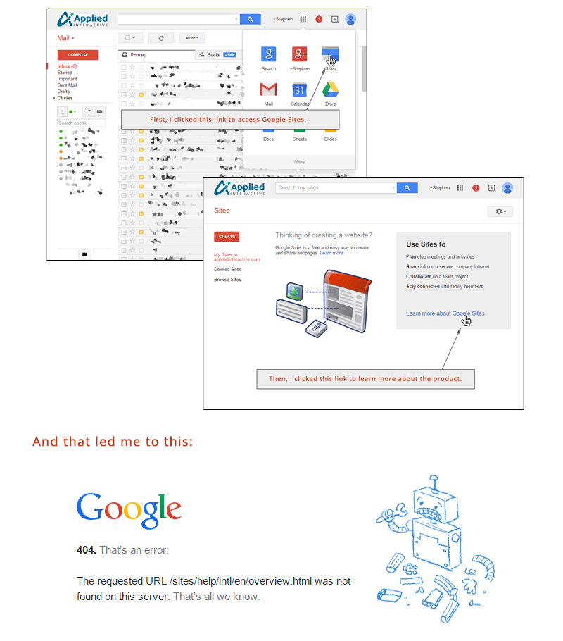
As many of you well know, when using a Google productivity suite product (gmail, drive, docs, sheets, calendar, etc…) there is a menu icon in the top right corner that, when clicked, displays links to all of the major Google offerings, allowing users to quickly access the suite of products. Every so often, Google rearranges the order in which these icons are displayed. This morning, still caffeine-starved, my groggy attention was alerted to the fact that the Google Sites icon was now in the space formerly occupied by the icon for Google Drive. I clicked the link to see if there was anything new and different that might warrant this new “premier” placement.
As can be seen in the following set of screen captures, my curiosity led me to be reminded that, even with a virtually inexhaustible budget and a huge staff available, things can still go wrong if no one is paying attention to the pesky little details.

One is left to wonder just how many potential users failed to convert because they weren’t able to learn more about the tool they were actively investigating.
And, therein lies the cautionary tale….
If a customer were to visit you in person, you would never leave them to wander around unassisted for any length of time. You certainly wouldn’t post notices about a product launch and then make your customers figure out how to use it on their own. The risk of having them wander away before they convert to customers, perhaps before you even knew they were there, is far too great. It’s no different with your website. You spent all that time and effort enticing that interested customer to your front door, only to fail to unlock it for them once they arrived. If your website’s UX (user experience) has dead ends that leave potential customers in the lurch, you are likely doing yourself more damage than you would if you had chosen not to have a website at all.
Aside from the customer you just lost (which is tragic enough in and of itself) you must also consider that others will be influenced by that person. Instead of having a satisfied customer out there singing your praises, you could very well have a confused, perhaps even disgruntled, person bashing you to everyone they know – and you may never even know it. As the cliché goes: “Bad word of mouth travels twice as fast.” Don’t be in a big hurry to prove that adage wrong.
The moral of this story is to make sure even the minute details are all buttoned up. When it comes to presenting your image to the public, quality control is paramount. In a piece full of quotes and clichés, I have one more relevant one to share:
“You never have a second chance to make a first impression.”
Make it count.
